Conclusion

The research and visual tests helped me to gain a deep knowledge of branding and identity design. When I finished my branding design, I gather a new design way which relate to my existing research. To my opinion, traditional brands not only have a long history but also they have become a unique symbol in their counties or even on a global scale. They are like an elder statesman who witnesses his country’s changes. It means traditional brands have become a part of national history. Therefore, when we design a traditional brand, we must consider its relationship with its country’s culture and traditional area. We can use cultural or traditional elements to add into its identity design. But when we use these elements to create a new identity, we must keep remember it must be a modern identity. Too traditional will not be accept in this international marketplace. On the other hand, these cultural or traditional elements have their own unique shape. So when we use them to create identity design, we can’t change their shape too much. People already recognize these shape and keep remember in their mind. Thus, if we change them too much, our consumers maybe can’t identify them. Therefore, we must keep their basal shape in our design. So if we can’t change the shape too much that how can we make them modern. Base to my research outcome, I am realizing that we can use different texture or colour to appear their shape. For example, traditional Chinese printing is use Chinese black ink and draws it on a traditional paper called rice paper. This kind of printing is a typical traditional style. But if we can use this traditional Chinese drawing skill and use colour pink to draw a traditional image on a metal piece. I think

this printing will be has a modern style. If we can’t change the shape, why not use other texture or colour to stand for the original stuff that reappear the traditional elements.

Although I have a new outcome, I think it still has some limitations in this research journey. For the data investigation I didn’t to research a broad spirit marketplace. I just focused on Whisky area and Chinese liquor area. For my project, I should do more case studies about the identity design not just look at the alcohol identity area. I should investigate into other identity area, like food, soft drink, perfume…etc. For my target brand identity design, I hadn’t done a deep research in the traditional Chinese culture. I should find a more perfectly traditional element and create it.

In this journey, I followed my learning agreement and strategic brief and step by step to do my research project. At the beginning of this research, I felt it was so tough to me. Because, my BA subject was product design and I haven’t much experience at branding identity design. But my supervisors and tutors gave me a very good introduction and guided me into branding design area. And they also introduced me some very useful books. These books helped me to understand what brand identity design is, how can I use different methods to do my research, how can I use community skill to have an interview or do a questionnaire with my target audience…etc. All of these useful suggestions and data was supported me and helped me to complete my aims. Finally, I used these knowledge and my new design way to create my target brand’s identity (include logo design, packaging design) as my visual outcome. In the end I want to say thanks to the people who were appearing in my research journey. Thank you to support me and encourage me to explore my design world. Thank you!

Colour problem and final design

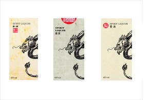
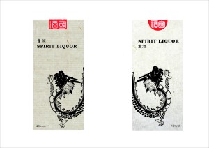
In branding identity design, image’s colour is a significant part that will affect brand’s visual impression. Furthermore, “Dong” liquor has two lines to sell their product in the international marketplace. One is for the high standard night club. The other is for the formal business banquet. Thus, I must use colour to distinguish these two collections. Moreover, I must find the suitable texture to match with the different colour packaging. For that reason, I looked back to the spirit marketplace and did case study about packaging’s colour and texture. After the case study, I began to redesign my dragon.

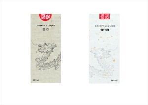
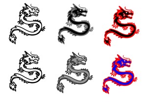
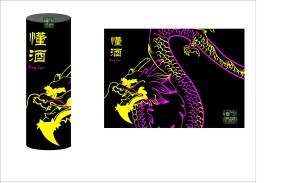
 Firstly, for the night club collection, I used the burning spirit fire colour as my inspiration. In a dark surrounding, when the spirit fire is burning that you can see different level colours light. Thus, I used fluorescent colours (pink, yellow, cyan…etc.) to stand for the colours light and I used these colours to outline the dragon’s body.

Secondly, for the business banquet collection, I luxurious jewellery tone (shimmering gold, silver, amber) as my idea colour. Also I used these colours to print the dragon’s body.

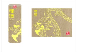
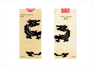
After I decided the colours, I began to find some suitable texture for my packaging. For my paper experiment, I used Internet to contact with GF Smith and FEORIGONI.UK and ask for different paper samples. When they sent them to me, I went to the print room and used screen print to do my experiment. Although the outcome was good, I through it wasn’t the final effect that I wanted. I through just used screen print to print the pattern on the surface, it wasn’t enough special. I wanted my packaging has some things that can distinguish with the other liquor packaging design. So I looked back to the traditional Chinese art form and wanted to find a art skill that I could use it to decorate my dragon. After the review I found Chinese paper cut is the art form which is perfectly matched with my idea. I wanted to use paper cut skill to cut dragon on the surface. In our university, I found a modern technic which called laser cutting is similar than the paper cut skill. Thus, I went to the laser cut and discuss with the tutor. And I decided use laser cutting to make my final dragon. Moreover, I added my decided colours into the dragon’s hollow part. When you look at the packaging, you can see a dragon which has a fluorescent colour or metal colour outline.

Make it again

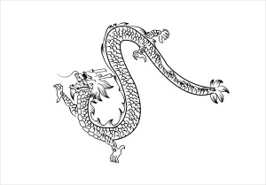
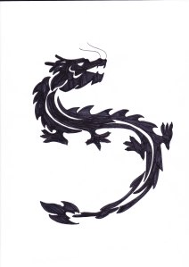
At the tutorial time, my tutor my dragon design and he thought its personality has appearing. But my dragon still looks like more traditional. So, I thought must reduce the details again and used black line to line out the shape. Thus, I redesign my dragon that based on the original one. I wanted to try my best to create a simple dragon that with a great personality.

Although I created the final dragon, I thought the lines are not perfectly. I want to keep my dragon simple, but also it has some special lines. So, maybe I use a traditional Chinese paper cut  to reappear my dragon.


Take the challenge

At the personal tutorial (24/05), my tutor and I found that my design had a problem. Both of us thought my dragon still traditional. I need to make it more modern. I thought to me this problem was like a challenge. As everyone knows, dragon is a unique symbol that existing at China about hundred years. Therefore, we can say dragon is the most typical traditional shape in Chinese art history. So make it modern was too different to me. I didn’t know how I can do. So when I came home and looked my dragon, I found the reason that my dragon looks so traditional was it hadn’t personality. So I must add some personality into my dragon’s soul. My dragon is like a powerful people and it has a proud smile that thinks it is the best stronger dragon in the world.

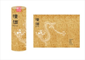
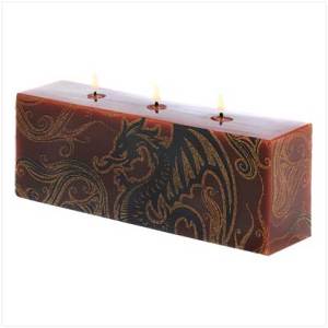
When I completed my dragons, I thought dragon’s position is the other important part in my packaging design. I didn’t want to my dragon just print on the front face. I want my audience can see the dragon pattern through the other angles. Thus, I decided just has half part shows on the front face. And the rest part is rounds on the other faces. It will like a dragon circles on the pole.

Own letter

Brand’s typeface is a important part of branding design. In my case, my target brand is an original Chinese brand. And I already designed a traditional seal logo, thus the brand name’s typeface must has connection with Chinese seal or calligraphy.

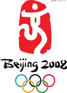
However, it is not a easy job that help a brand to create its own typeface. Moreover, my target is a Chinese brand. So how can I use traditional Chinese letter shape to design a new English typeface? Therefore, I though I need to study some cases which can give me some inspirations. When I researched online and looked some books, I found 2008 Beijing Olympic Games’ symbol was a good example. 

The “Dancing Beijing” emblem, depiting a Chinese seal inscribed with the character “Jīng” (京), from the name of the host city in the form of a dancing figure. Moreover, the designer used Chinese calligraphy style which called Han Dynasty (Han Dynasty bamboo text) to design the “Beijing” letters’ shape. Thus, I thought I also can find a Chinese calligraphy style to create my own letter.

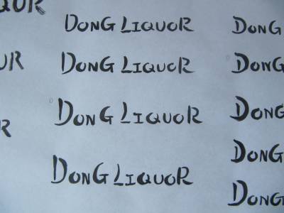
After that I chose the best line letter and added them into the PC. And I used software to make their contour character more clearly.

Develop my own dragon

When I met with my tutor, we shared the view that Chinese dragon is a good idea to use on the packaging design. But how can make it modern is become a difficult problem. Therefore, I researched at the different area and learned how people change the dragon’s shape and recreate a modified dragon.

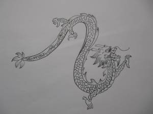
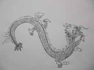
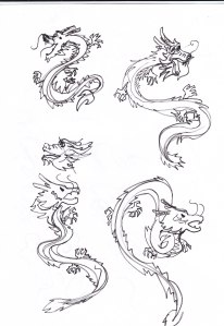
To my mind, Chinese dragon always has a traditional shape and has lots of details on it’s body. So, I thought make it to be a modern dragon must reduce the details and use simple line to design the shape. So, I use pencil to create my own dragons which have different shapes and poses.

I chose two powerful dragons and used them at my packaging. Because my liquor has a strong taste, therefore I wanted my dragons has a arrogant personality. Also I used traditional calligraphy for the background pattern that can better shows this brand is comes from China.

Stand for China

To me “What element can stand for China?” that is a hand and significant question. And it also became the hot topic when I talked with my tutor. I thought that element can comes from different area. Like music, painting, architecture, handicraft……So I think that element must has a typical form or has a profound effect at traditional art area. There are too much elements that can stand for China, for example: panda, The great wall, forbidden city……But to my mind, I think my element is a kind of thing who has a powerful energy to effect Chinese traditional culture. And this element also is a typical shape that people like to use it add into the art or culture field.Finally, I decided dragon to be my core element.

The reason that why I chose dragon is Chinese dragon is a legendary creature in Chinese mythology and folklore. At the antique times dragon was the symbol of the Emperor of China. In the traditional art area dragon also is a symbol of power, strength and good luck, therefore many artists will use dragon to create luxurious artwork. Moreover, my target brand is an expensive alcohol drink, thus to my brand dragon is the most suitable element. But the most significant reason is many Chinese people often use the term “Descendants of the Dragon as a sign of ethnic identity and dragon is sometimes used in the West as a national emblem of China. For the international identity, I thought dragon is the best choose that people can easily identified this liquor is comes from China. Thus I began to create a dragon symbol for my liquor brand.


Case studies and problem

When I finished my first draft, I think I need to look back other existing alcohol brands’ branding design. To learn how they use local or national traditional elements to create their brands’ identities. When I did the case study, I found a Japanese whisky brand that used traditional elements to do its identity in a perfectly way. This Japanese whisky is called “NIKKA WHISKY”.The “NIKKA WHISKY” is a product of Japanese whisky located in Hokkaido. This brand is the famous Japanese whisky brand. When I travelled at Scotland, I found lots of whisky shops are selling this brand in their stores.

NIKKA WHISKY used white or clean colour for the packaging’s background. And it used calligraphy for the different collections’ logo or name. 

When you see these two types whisky, they also used landscape as background’s pattern. These images are the sites of NIKKA WHISKY’s traditional factories. NIKKA use packaging design to connect with brand’s history. It also tells people that whisky has a long history and being a well-aged to produce the whisky. I like their overall concept, we can easily see that these products are from the same brand.

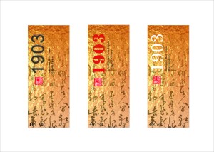
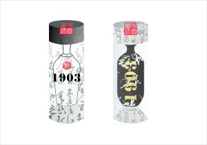
 When I finished my case study, I thought a traditional brand always established of a long time ago. So a typical age or year can become a important elements in this project. Thus, I redesign my draft and use a year number to be a mina idea of the identity. 1903 is a significant year of ‘Dong” liquor. At the end of “Qing” dynasty (1903), “Cheng” family’s offspring called Cheng Ming Qun which investigated in local water, weather and soil that through the way of distil to manufacture the purest liquor. After that he used lots of different Chinese herbs then soak with liquor. When he finished this process, he brewed the original “Dong” liquor. So, 1903 is the birth year of “Dong” liquor.

I used 1903 this number as the logo of “Dong” Liquor and identified this year on the packaging.

After I finished my draft, I found a big problem. I think calligraphy is the gap between my design and ‘Dong” liquor. The reason is I found that lots of Japanese sprint brand also used calligraphy for their brands logo and identity mark. And traditional Chinese calligraphy is similar than the Japanese calligraphy. I don’t want to explain why they look so similar. I just worry about my audience will think “Dong” liquor is comes from Japan. Especially Japanese sake is so popular at the international marketplace. I don’t want to consumers think is Japanese sake. Therefore, I must find another way or elements to create a new image that people will not think my product is come from other countries.

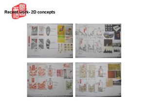
My2D Concept

As my target “Dong” Liquor is a well-aged traditional Chinese brand, therefore I want to use some traditional elements to create its international identity. So I looked back to the traditional art area and skill that I thought traditional Chinese calligraphy could be the core of my design concept.

Chinese calligraphy can be seen as the backbone of China’s artistic tradition. This branch of art was and still is the most dominant vehicle through which the Chinese express their emotions in the world of visual art. Then I tried to use different shape calligraphy to create my packaging. When Chinese artists completed their calligraphy, they will use traditional seal to stamp a mark on the work’s surface as a signature. Thus I thought Chinese seal could become the other idea in my design. So, I used seal software to create a new logo for my liquor brand. Calligraphy and seal logo is become the base concept in my design. On this basis, I added other elements to design other styles.

Conpect-1


Conpect-2

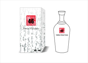
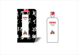
I used calligraphy as packaging’s background pattern and zoom in the 46 degree. 46 degree is means in 100mi. liquor the proportion of alcohol is 46 percent. 46 degree is a specifically prevent in Chinese liquor area. And it also reminds people that liquor’s taste is the same stronger as the Whisky.

Concept-3

“Dong” liquor technology has a long history. The traditional process is the secret core in the “Dong” liquor brand. Therefore showing the traditional process is the other idea of my project.

 Concept-4

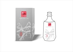
Showing the location of “Dong” liquor is my third concept. Make a local map to cover the whole liquor’s packaging which can show the “Dong” liquor factory’s location. Also using the Chinese location name that can tell people this map is introduces a part of China.

 Concept-5

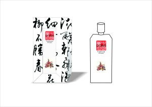
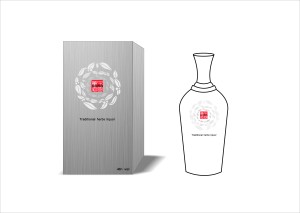
“Dong” liquor is use traditional Chinese herbs to make its own special taste. Herbs liquor is not familiar to the international audience. Maybe it is a new point to introduce “Dong’ liquor.

 When I finished my first draft, I think must continue to develop my idea. These ideas are not the suitable concept of my project. I must find the best to explain the meaning of “Dong” liquor.

Working process presentation

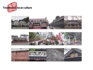
At the Christmas holidays, I went back to China and investigated local liquors’ retail environments, “Dong” liquor’s factory and recorded the traditional local culture in my hometown-ZuiYi city.

To my mind, I don’t like alcohol drinks, so I have never put my attention on the liquors’ shop. Therefore, when I investigated in Zuiyi city, the local liquors’ retail and their shops gave a big surprise. Because I never thought the local liquor can use traditional elements to promote their visual identity in a great way. So the local liquor retail gave me a very nice impression. Moreover, they let me know how to use Chinese traditional elements to decorate the brand’s visual identity.

These liquor shops are like a special agency which just sells the one liquor brand’s products in the individual shop. These agencies are consisting of two different selling places. One is outside, other one is inside. I am so interesting in outside selling place. Outside selling place is means, liquor agencies would choose some empty places which in front of the shops and built some mini-exhibit tables to show or sell their liquor. These tables are like an exhibition; they will show the different level and taste liquors to our consumers. If you haven’t time to look around in the shop, you can just look at the outside selling place and but some mini-bottle liquors.

Before I went back to China, I contacted with the “Dong” liquor factory manager. And he gave me a great opportunity to investigate in the “Dong” factory. Because, in 1983 Chinese government listed “Dong” liquor’s technology and its stuff have became the confidential process. So, I just could take some photos at the free areas. After the visit, I had a chance talked with the manager and he introduced me the history of “Dong” liquor.

 And then, I spent few days time to visit the local historical sites and walked around at the antique streets. Also I used my camera to record the inspirational elements.

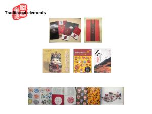
For my design, I also collected some useful books about the traditional Chinese art forms. These books are like the basic elements in my design.

 When I came back to Nottingham, I began to arrange my research data and make some moodboards. For example, “Dong” liquor’s process is forbidden publish. Therefore, use these secret things to show a mysterious story on the packaging design is my first concept.  For the secret process, the liquor packaging is like locked treasures box that waiting people to find the mysterious taste. Moreover, in China the traditional red stamp also can in stand for the secret. So, open the liquor box is like discover a secret data. Thus, treasure box and secret stamp is my second concept. When my moodborads came out, I began to plan my 2D concepts sketches.

In China the traditional red stamp can stand for the top secret. And the traditional Chinese calligraphy is the typical one of the Chinese art form. Everyone can identify this art form is come from China just like everyone knows The Great Wall is the signature of China. Thus, I used traditional red stamp which combine with traditional Chinese calligraphy to make a special logo for my target brand. And this symbol is appears at every piece of my design. Also, the brand’s logo is used English letter combine with the red stamp.


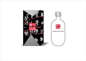
The mysterious processes are the significant part of “Dong” liquor’s selling point. Therefore, I designed the liquor’s box is like cover with a dark paper. If you want to know the secret, you must rip the box. So at the front of the box, I make it like someone ripped the dark paper. And through the missing part you can see the mysterious processes picture.Open a door is a process before you want to discover the secret. Therefore, I want to use some paper which print with Traditional Chinese calligraphy. I want wrap the liquor box in this special paper. Moreover, I used the cord to pack this box and paper. The cord is not only like decorate the liquor box make it more traditional, but also like a interaction which connect the product to the consumers. It is like a active selling. And the red stamp also stands for the secret.

For the next stage, I keep going to develop my ideas. Also I will continue to think a suitable brand name for “Dong’ liquor’s international audience.